Before-After Case Study
Customers often ask me to improve the curb appeal of their home and property. Curb appeal is your homes first impression. It is what you and others first see when approaching your home. In real estate great curb appeal sells homes. For homeowners there is a sense of pride and accomplishment when your house looks great. I recently posted on social media a picture of the front of a home we did a few years ago and commented on how great it looked. Then I started thinking, I should share the before picture and then analyze why the after is so much nicer.
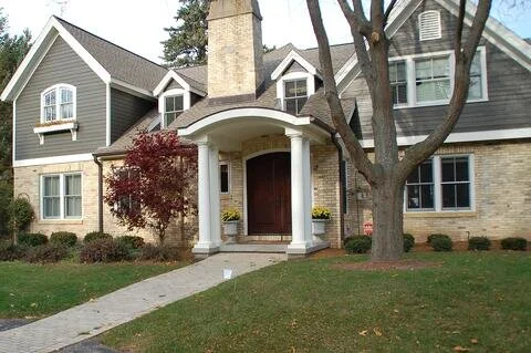
The picture below is from before our work. It is not bad. There is a brick walk and some plantings. But, there is not much curb appeal. What makes this such a dramatic improvement?
Landscaping near me in Madison, Wisconsin
Now the after picture.
Color
The tumbled bluestone driveway and random bluestone front walk compliment the homes siding and roof color. It makes a connection grounding the top half of the home to the landscape. The fox valley stone wall creates a connection to the brick on the house and adds depth.
Front door framed
The white columns existed prior to our work. But, they faded in with the white trim on the house. Now, with the new color and material pallet they pop and become the focal point leading guests to the front door.
Plantings
Plantings soften the hardscape of the front walk, driveway, and retaining wall. This planting illustrates my planting design principles for front yard. Boxwood hedge and and pachysandra ground cover are evergreen keeping mud from the front walk in winter. White flowers spring up behind the hedge.
Simple and elegant makes for amazing curb appeal. Complementary materials in the landscape and home.


